
Cala Homes embarks on five-year plan with rebrand
Housebuilder Cala Homes has unveiled a vibrant new look which it said will reflect the evolution of the business and align with the company’s customer-centric, innovative, and inclusive culture.
Following years of successful growth, Cala has embarked on a comprehensive five-year plan which has renewed its vision and purpose internally, set out ambitious sustainability commitments and evolved its people approach. Cala has worked closely with creative agency, Frame, to shape a new visual identity which captures this, representing an exciting new chapter for the business.
Kim Pointon-Taylor, Cala’s director of group marketing, who has been with the business for eight years, said: “Cala is incredibly proud of its heritage and brand, and we wanted to honour that. However, it’s 15 years since our last major brand refresh and in that time the business has grown and progressed. To reflect those changes, we were keen to create a new visual identity to represent the company we all see from the inside – not just a leading home builder, but a forward-thinking employer, a champion of our sector and a business determined to play its part in looking after the planet.”
At the time of the last major brand refresh in 2007, Cala was building around 1,000 homes a year, largely bespoke product and executive homes. Cala has now grown to deliver around 3,000 homes a year across the UK, ranging from starter apartments in Aberdeen at £125,950, to £1.5m homes in Edinburgh. In its preliminary 2021 results, the 5* house builder reported record completions, revenue and pre-tax profit, and set its sights on future growth. Cala achieved a strong rebound to exceed pre-pandemic volumes, as people sought its offering of larger living spaces in aspirational suburban locations.

Cala Homes' director of group marketing Kim Pointon-Taylor
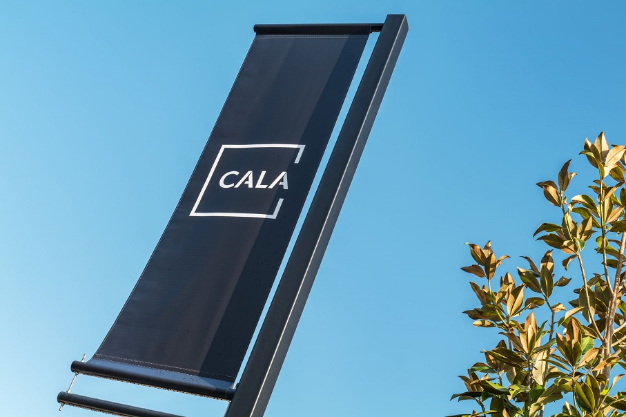
Moving away from its well-known gold and black colour scheme, the revised Cala Homes branding has been developed with sustainability, modern media, and accessibility in mind:
- A new, simplified logo: retaining the distinctive black square, but moving toward accessible design with higher contrast lettering and a font choice to aid recognition. The high-contrast black and white logo and each of the new colours were chosen to consider the needs of people who are colour-blind.
- New typography: for greater legibility, the weight, size and style of the new typefaces have been selected for their legibility on screen, and for people with dyslexia or visual impairments.
- Spelling: a new spelling of Cala in text passages will better meet the needs of customers with visual impairments or dyslexia, and those using screen readers (previously capitalised as an acronym ‘City of Aberdeen Land Association’).
- Sustainable signage: the ability to produce development signage and company stationery in a more sustainable way, through the removal of the metallic gold colour.
- Inclusivity: a more conscious drive toward inclusion and representation across race, gender, sexuality, ability, and age in imagery.
Kim added: “This fresh approach to our brand complements the direction that the business is moving in. Our product range has evolved to appeal to a much broader scope of customers than ever before, in more locations than ever before, making a Cala home an attainable aspiration for many more homebuyers.
“The rebrand has also allowed us an opportunity to ensure our brand is accessible for all, meeting the needs of customers and stakeholders with impairments or disabilities, and reflecting our belief in being an inclusive business. We have been mindful that the colours, fonts and particularly the images we choose can play a role in making a positive difference. These details ensure that our identity is as modern, relevant, accessible and inclusive as Cala itself.”
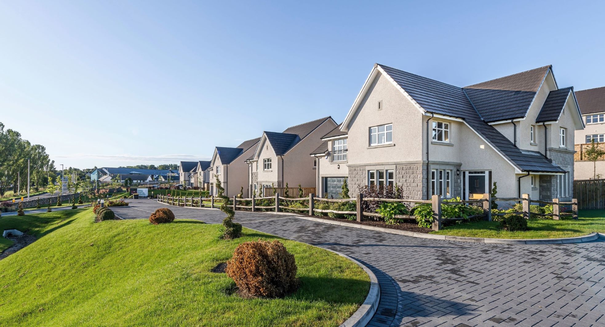
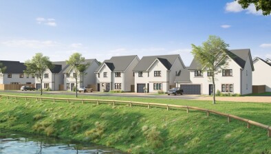
Homes by Cala at The Grove, Inverurie
The refreshed brand has now been rolled out through digital channels. A phased roll-out, planned in collaboration with Cala’s sustainability teams, will be deployed across developments and head offices over the next 18 months, to avoid generating unnecessary waste.
Piers Banfield, group operations director, has been with Cala since 2014 and added: “It is a very exciting time to be at Cala. We have a clear vision for the future, a strong focus on sustainability and what we believe to be an unrivalled culture. We know our positive impact goes way beyond developing new homes, and this brand truly reflects what it means to be part of that.
“This is an identity befitting the Cala experience today, not only for our customers and communities, but for our business partners, subcontractors and employees too. It is a brand that reflects our new focus, our confidence and ambition, whilst respecting our historic identify. It is designed to appeal to a different era and audience and will help us grow our reputation with new generations.”